Our award winning project, Dubai Property for Sale. Focused on providing all of the information a potential investor could need.
THE BRIEF
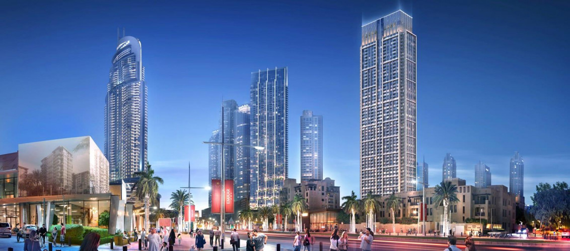
Property website for dubai property for sale. Dubai Property For Sale needed a bespoke website design that emitted a premium feel, due to the nature of their high end developments in the Gulf region. We built a website based on the WordPress platform with a custom system for storing their latest developments, allowing them to grow the website over time, quickly and easily.
TIMEFRAME
24 Weeks
PLATFORM
Woocommerce
As well as looking good across devices, the priority was to build an underlying system that worked quickly and efficiently that also integrated with their back-office ERP system to pull live stock updates.
After using Magento for past projects, they wanted a platform that allowed them easier access to edit content and run promotions. We recommended Woocommerce as a solution to this.
“Having worked with a lot of different E-Commerce/Web agencies in the past, we’ve found that Imaginaire are able to cover all areas with a level of expertise and knowledge that comes from genuine enthusiasm, ability and experience. From a technical view point, they can clearly stand by the numerous custom coding and bespoke plugins that they develop. From a marketing angle, they not only understand the basics of what’s required to help a Website to grow successfully, but they are also able to identify genuinely original ideas. Lastly, I’d say that they certainly stand out in terms of their ability to build a Brand identity, and the in-house design skills are excellent (this is often a big let down with more technically able agencies). Overall they deliver on time, to a high standard and are very amenable to work with. I’d recommend them to anyone outside of our competitors!”
James Lewin, Hyperama PLC (Bring Me Drink)
After an in-depth discovery meeting with the client, we saw a gap in the drinks market for a playful brand rather than the typical, conservative brands that were already out there.
We opted for a rounded font (Nunito) and decided to have 3 key contrasting colours — a red, orange and blue.
The logo was deliberately kept very simple, we wanted to keep it on one line so that when used on their website, the mobile header area was minimal and didn’t get in the way of their products.
The website had a few clear priorities to appeal to the mass market:
The website is responsive, but we veered away from the usual “design for desktop first, then strip away components as the devices get smaller” and opted for a mobile-first design methodology.