When it comes to website design, simplicity is often key. If you want to hold a user’s attention, there’s no good in bombarding them with pages flooded with information. This is where Whitespace comes in.

It’s basically the empty space between the elements that make up a page. When you think about design, it’s probably the typography, layout and imagery that springs to mind. However, Whitespace is equally important and should have just as much consideration. It can really have a make or break impact on your site as too little Whitespace can be unappealing and obtrusive to users.
As you sit down to plan your site, always keep the mantra “less is more” in mind. Think simplicity, elegance and style as this type of website bodes much better with users. Google, PayPal and AirBnB (to name just a few) are all brands that master whitespace and clearly understand its importance. To give you more of an insight, here’s 5 things you need to know about whitespace.
1. It doesn’t have to be white

Ok, this is probably an obvious one to start with - but important. Some people do make the mistake of thinking this has to be exactly as the name states. However, that’s not true. It can be any colour you choose as long as it’s clear of any text or images.
2. It helps to focus attention
If you want your audience to hone in on a specific object then what’s better than placing that single object on a bed of white. When there’s nothing else to see, the eyes will be immediately drawn to that single entity.
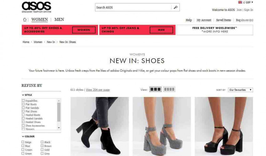
It doesn’t necessarily have to be a single entity either. Think about ecommerce websites like ASOS. Each product is broken down by a clear area of blank space which gives the eye a break between the items. If the background was busy and full of detail, it would not only distract the user but also make for a worse browsing experience.

3. It improves your site readability
If you take time to consider margins and spacing, your text will be much more legible and therefore enjoyable to read. When you visualise your favourite blog, is it packed full of copy or does it have a good ratio of whitespace to text? I’d put money on the latter.
This is something that you really have to consider, particularly if your site is quite text heavy (which it shouldn’t be, but that’s a different matter). We know in this day and age that no one likes online essays so text should always be broken into manageable chunks anyway. That’s where Whitespace comes in, so take some time to review your pages and ensure that it’s broken down with sufficient spacing.

4. It looks more professional
The sites that have had the most thought put into them are often the ones with an excellent whitespace ratio. Not only does it improve readability but it looks professional. A clean, slick website with only the necessary information gives users what they want. They are able to navigate the site with ease and scan text quickly providing a good browsing experience.
5. CTAs get more attention
A call to action (CTA) is the element that tells your website visitor what to do next, whether that's to call you, or fill out a contact form. CTAs are vital parts of a website with a high conversion rate and whitespace helps you with that.
With a good amount of Whitespace, your all important CTA won’t be obscured by unnecessary noise. As it plays such an important part in conversion, it’s crucial that users can see and hopefully be drawn to acting.
To sum up
Over recent years, the number of websites clearly using Whitespace has grown. Businesses are increasingly understanding the importance of the component and not opting to just fill the dead space. As you now know, this is not just ‘dead space’ and should be considered as much as you consider typography and images.
If you’d like to learn more about web design or to get help with your site, we’d be happy to help. Call us on 0115 939 7572 or visit our contact page.