
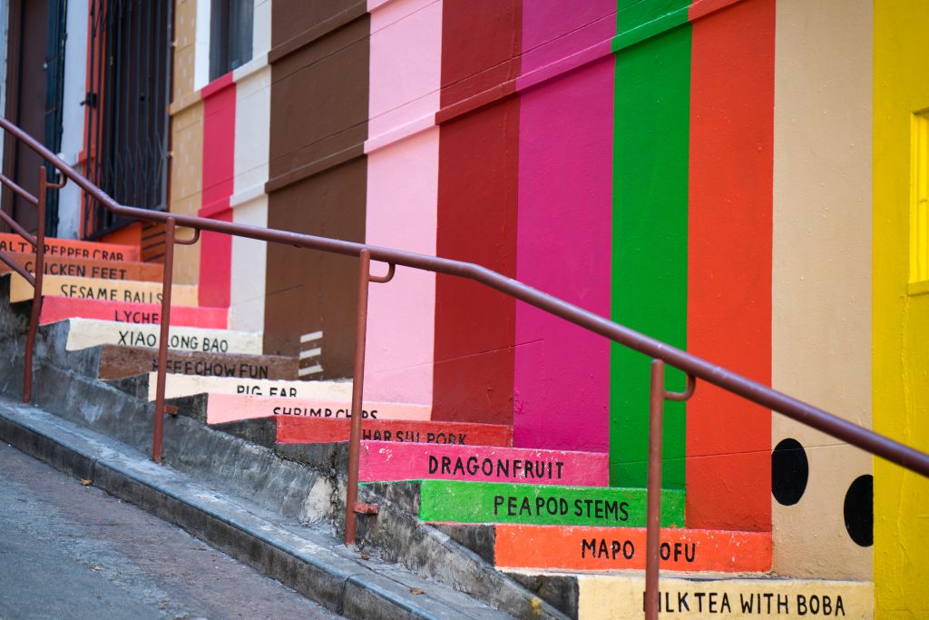
One of the most instantly recognisable features of a brand is its colour scheme. For example, Virgin Media’s red or Easyjet’s orange. Whether you’re a corner shop or a huge corporation, colours are going to form an integral part of your brand identity. They will be used in your logo, website and on all of your customer marketing materials.
So when it comes to choosing a colour scheme for your brand, a lot of thought needs to go into each decision. Here are thoughts on this topic to tell you more.
Search For Inspiration
Before you choose your colours, it’s a good idea to see what your competitors and the design world, in general, are doing. No, the reason for this is not to copy them! Instead, what you are looking for is how your brand slots in both in terms of the company itself and the type of design features that would work for the current market. This method is great to ensure your ideas are fresh, original and not in any way dated or too similar to what’s out there already.
A great place to start is to check out the Pantone colour of the year. While that doesn’t mean to say you should necessarily brand your company in this year’s colour, it does give you an idea of what’s favourable. After all, it’s not just the colour itself but the tone, such as pink can be hot pink but also salmon or dusky pink too. The clue is to figure out where your brand sits, and what colours would best communicate with your audience.
Establish Your Brand Identity

Who you are, what you want to say and to who will all influence what colour schemes would work best for your brand. While it’s tempting to pick colours based on what you like personally, try to keep your brand in mind at all times.
Every brand should know their USP as well as their target audience. Look at your website and social media analytics and see who is consuming your brand. Choosing your colour scheme is about fusing the two so that your visuals connect with your audience.
Explore The Meaning Behind Colours
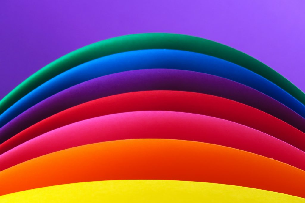
Working out what colours would best represent your brand is fundamental. On a previous post, we talked about how colour theory affects conversions. Every colour has a series of connotations that are attached to it. For example, blue is commonly used by banks or news websites because it signifies trust. However, blue can also be quite melancholy just as it can also be calming.
Colour meanings aren’t necessarily finite either, but it pays to do your research about the signals you could be sending out to your customers without even realising it. People are quick to make decisions about a product or a brand, and the visual aspects play a huge part in this.
Select Primary, Secondary & Neutral Colours
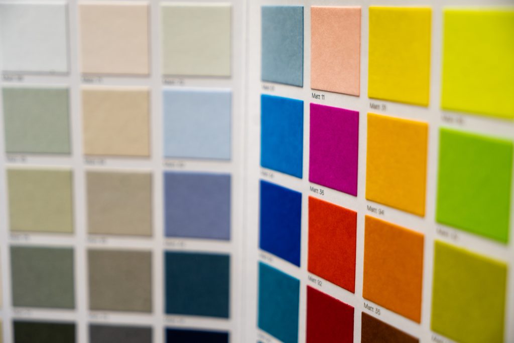
While you may associate a particular company with just a single colour, a designer will usually specify 2-3 colours that would work for the overall colour scheme.
The main colour is known as a primary colour, followed by the secondary and tertiary colours. It’s a good idea not to go too crazy with the number of colours you use, as you ideally want them to all still be recognisable as your brand. But, choosing a small handful allows for some flexibility, especially when it comes to the different areas of services your business provides.
Test Your Colour Scheme
As the old saying goes, ‘the proof is in the pudding’. Road testing your colour scheme will provide you with invaluable feedback. Try creating business cards and draft social media headers. Have a look at how the colours look in both print and digital use, to check if they have the intended impact or not. Play with the colours and experiment with negative space. If you’re unsure, sleep on it and then take another look at it.
Top tip: Colours have an RGB code for screen use and a CMYK code for print. If you view your CMYK colours on a screen they will look garish and vice versa! So always be sure you are using the correct versions of your colour scheme.
Should I Change My Brand Colours?

There’s no doubt that changing up your colour scheme even marginally can have a huge impact on your overall brand appeal. New colours can also give a much-needed refresh to dated design, as demonstrated in the recent Aer Lingus rebrand.
A common question for those looking to rebrand is whether they should scrap their existing colour scheme or not.
The answer depends on what your current colours signify. Colour theory plays a huge part here, But as a brand or business owner, you must also decide whether your current colours best reflect what it is you do or not.
It’s always worth experimenting with colours as well as the tones of colours. Talk with your designer about the meanings behind the colours, and see if a better solution exists.
Find Out More
If you would like to learn more about choosing a colour scheme for your brand then you’re in the right place. Here at Imaginaire, we help businesses understand their marketing and develop strategies to boost conversion rates.
Aside from colour schemes, we can help you with the likes of web design and SEO too. Drop us an email or call us on 0115 939 7572 to find out more.